-
Traffic
Get More Traffic
SponsoredLinX offers a number of different services to help drive more qualified traffic to your website. Google Ads Management Search Engine Optimisation Microsoft Ads Facebook Advertising Google Ads Mobile“SponsoredLinX are a rarity in today’s market place, they promise a lot but deliver more. Our business has grown by over 400% in one month; we are amazed at the difference they have made.”
-
Conversion
Convert More Leads
Our second step is making sure that your website is able to convert the traffic you receive into leads for your business. Optimising your website to convert more leads is important to a profitable campaign. Web Development Convertopages Do It For Me eCommerce Social Media Posts“I just want to say thank you! The changes that you have applied in our AdWords campaign have definitely seen an improvement on click quality and sales for HippityHop.”

Check Out These Five Common Mobile Mistakes
We now live in a mobile first world, and it’s vital for companies to get their digital experience on point. However, while many senior marketers understand the importance of mobile experience, they can still get it wrong.
Having been around for the start of the mobile boom, SponsoredLinX has witnessed its evolution first-hand. What worked in 2007 probably doesn’t in 2017. And, with increased data speeds, greater processing power, high definition screens and free, available content everywhere — the bar for ‘mobile excellence’ gets raised almost on the daily.
With that said, here are five basic tenets of mobile that marketers should adhere to.
Assuming You Need An App
If you’re sitting around a table right now with your executives talking about an app, the first question you should be asking is “why?”.
According to this article by SurveyMonkey, only two companies- Uber and Amazon- feature in a “most downloaded” list. And the reasons behind those are evident. What the lack of other brands in this list reveal is that people use apps for entertainment before anything else. So, unless you have an active niche audience, require deeper functionality, or want your audience to make use of you in the absence of data connectivity (like Spotify), don’t fall into this trap.
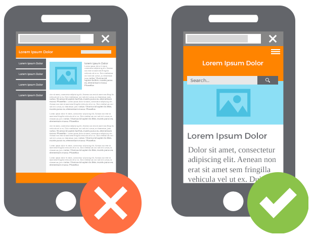
Treating Mobile As A Web Experience Bolt
Thinking about mobile as a bolt onto web experience, and not designing for micro moments or mobile only experiences is another mistake marketers make.
As most companies have invested in a website for the last two decades, some take the easy way out when designing a mobile experience. This means attaching a smaller version of their site or creating a responsive experience that utilises basic templates in comparison to customising a mobile specific design that dictates how content, design, and navigation are displayed. This often results in a disjointed and clunky experience for mobile users.
Adding Non-Mobile Friendly Content
It should go without saying, but marketers should not be adding non-mobile friendly content types for their smartphone experience. Document types like PDFs that were built for desktop don’t look any good on a 4-inch screen.
Infographics don’t really work either, no matter the design. Instead, rather convert each item to a slideshow or as a progressive scroll. If you feel like you must include these, give users the option to email themselves a downloadable link to open on their desktops/laptops.
Forgetting Mobile= Smartphones + Tablets
One thing that’s always interested us is how people like analysts and journalists group smartphones and tablets together when they discuss “mobile”. And, while there is some merit to that, the environments, expectations and types of tasks the two can do can be as dissimilar as a laptop and a desktop.
What your job as a marketer involves is studying your analytics to determine where your site visits are coming from, and then customise the journey accordingly
‘Mobile First’ Is Not ‘Mobile At All Costs’
Normally starting with mobile is a good solution, but it isn’t always the right solution. In fact, depending on the task at hand, where you expect consumers to interact, and the audience itself — mobile may still play a role, but not the lead role.
Hence the importance of a ‘customer first’ approach over a ‘mobile first’ one. If your customer base is the over 60s who don’t all have smartphones, then you need to adjust to suit. It’s vital you understand who’s making use of your service, and whether or not your investment should reflect more on a refined desktop experience over a mobile one.
Not Localising Experiences, Content And Design
Ignoring locality, meaning what works in Australia or Europe doesn’t work in Asia or vice-versa is a common mistake. This is one of those things that’s more about content creation and process versus design (although a country-by-country user experience is more important) so thinking through global support upfront is an important step.
Clearly, there are many other mistakes marketers make when it comes to creating and designing mobile experiences. Today we’ve looked at 5 which are a good place to start when evaluating one’s mobile strategy.
It’s worthwhile studying how you’re performing on mobile every few months (such is the nature of change) and adjust your strategy to suit the times.
Struggling to create a mobile strategy? Our experts at SponsoredLinX are able to tailor make mobile campaigns depending on your needs. Get in touch on 1300 859 600 today!


